ANANYA MOHAN
![]()

1. TITLE / (नाम)
2. YEAR / (वर्ष)
3. INFO / (जानकारी)
4. WORK / (कार्य)
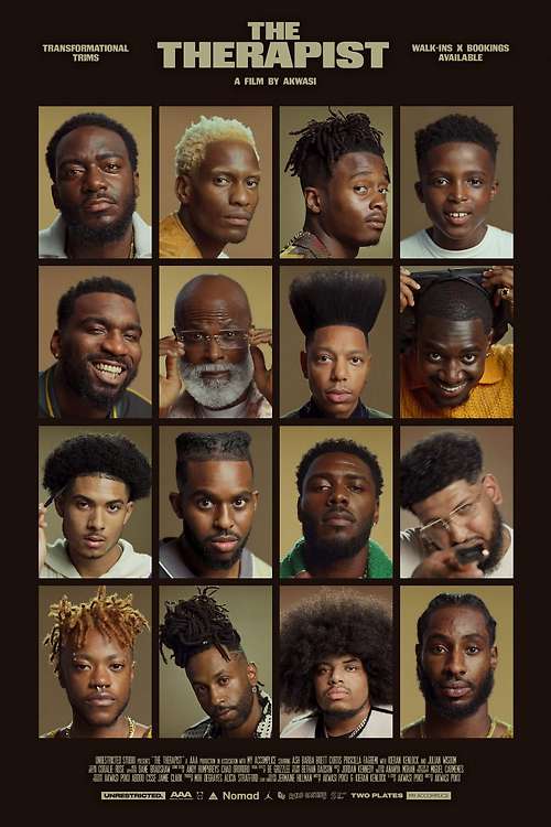
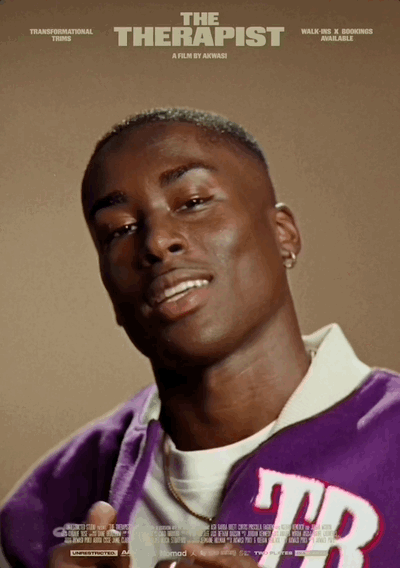
THE THERAPIST
Akwasi Poku (KWESS)
Director: Akwasi Poku
Photographer: Akwasi Poku
Cinematographer: Henry Gill
Design: Ananya Mohan
Akwasi Poku (KWESS)
Director: Akwasi Poku
Photographer: Akwasi Poku
Cinematographer: Henry Gill
Design: Ananya Mohan
2024
Design and titles for a short film exploring Black men’s mental health and the often overlooked role that barber-shops play in providing a space for restoration and healing.
It’s Nice That
WePresent
It’s Nice That
WePresent


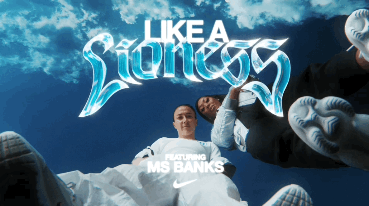
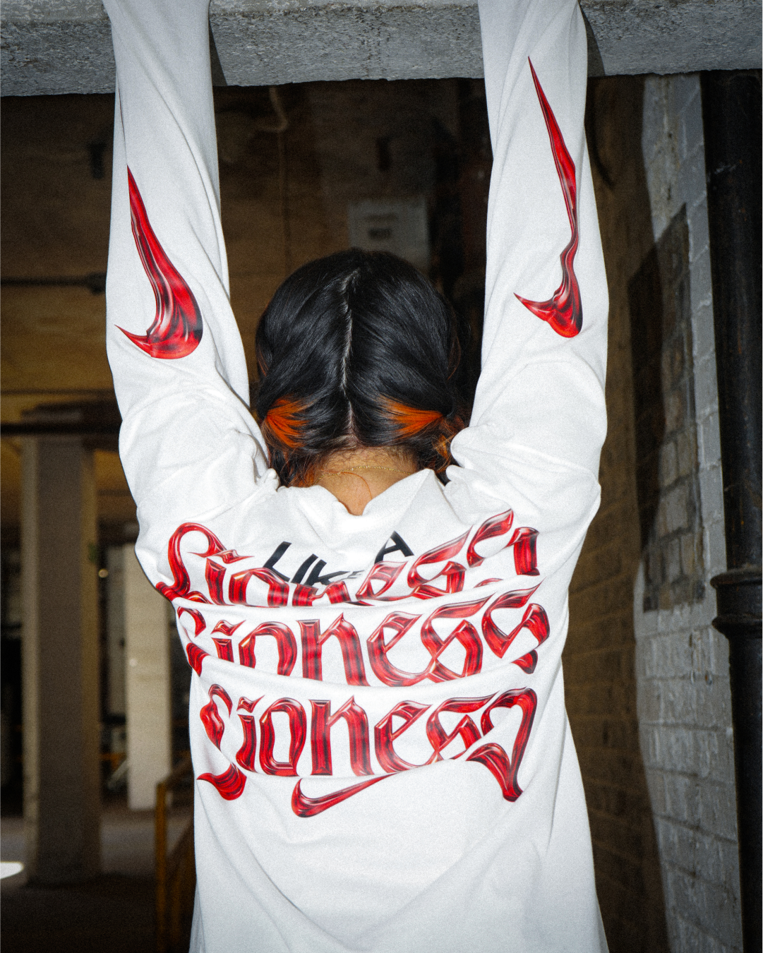
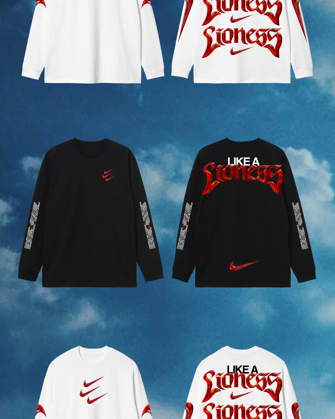
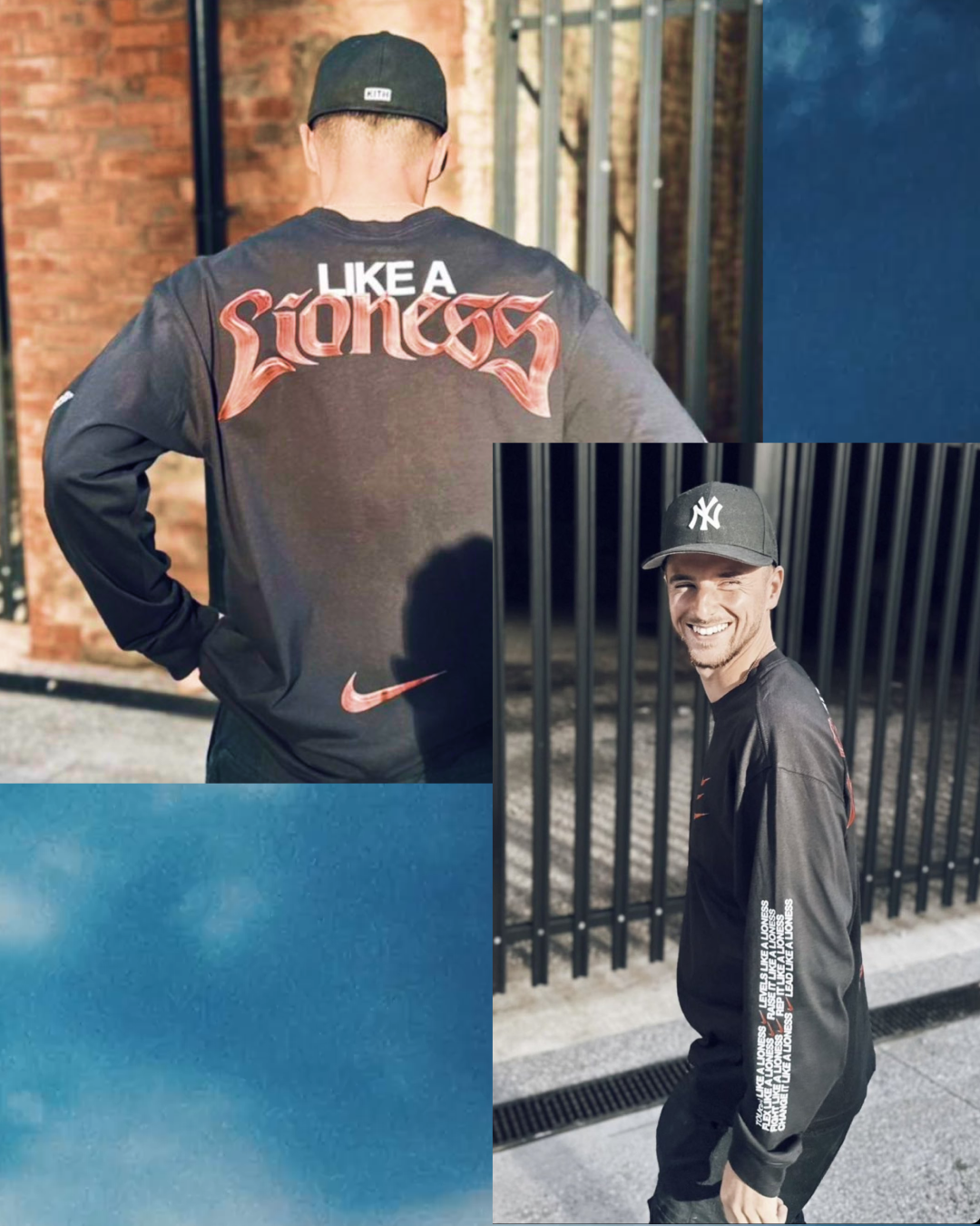
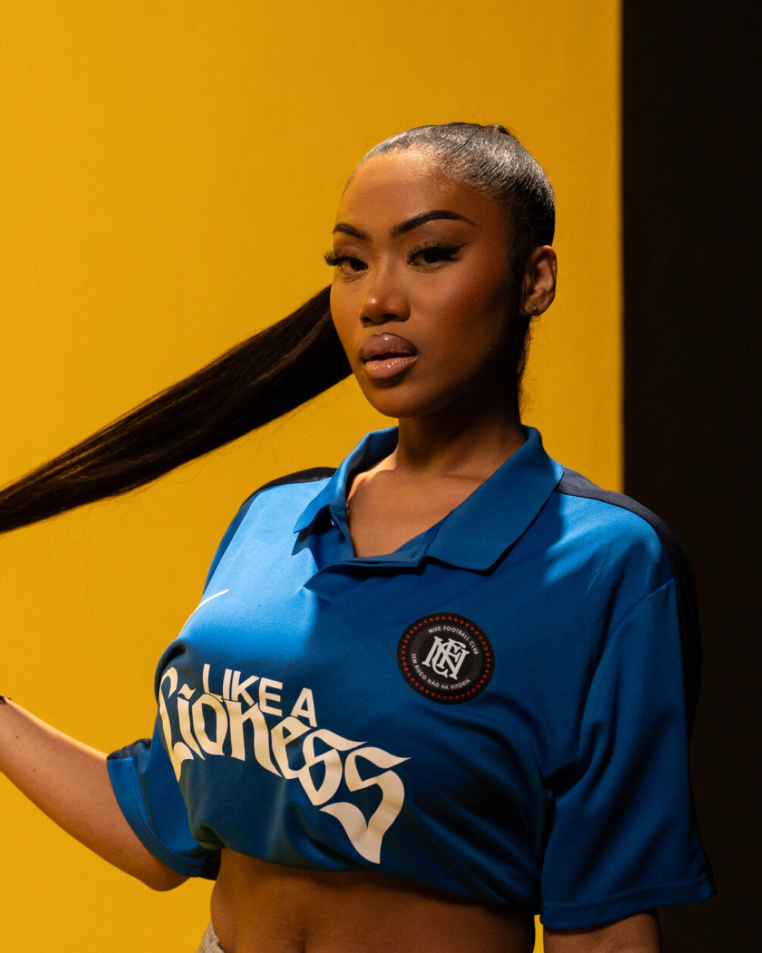
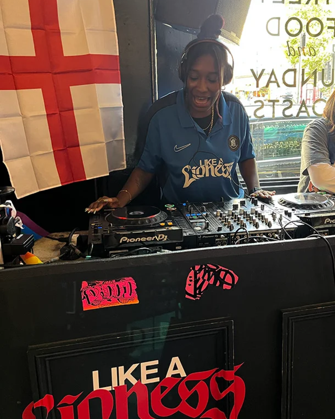
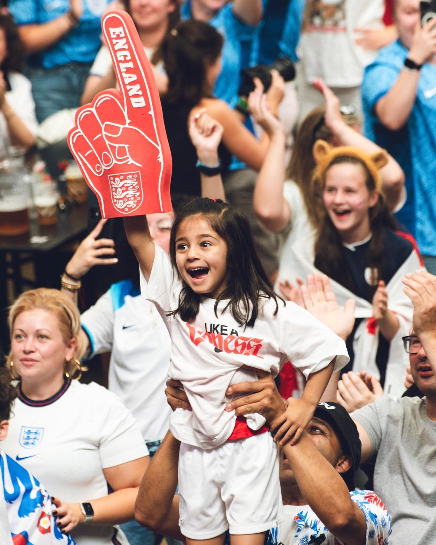
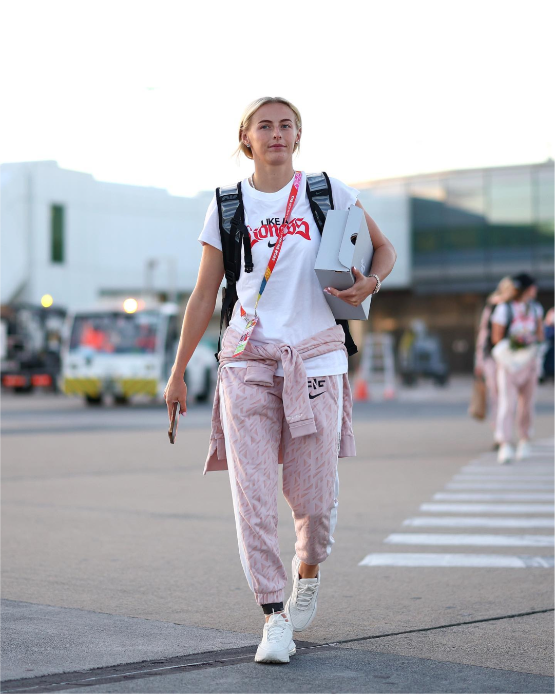
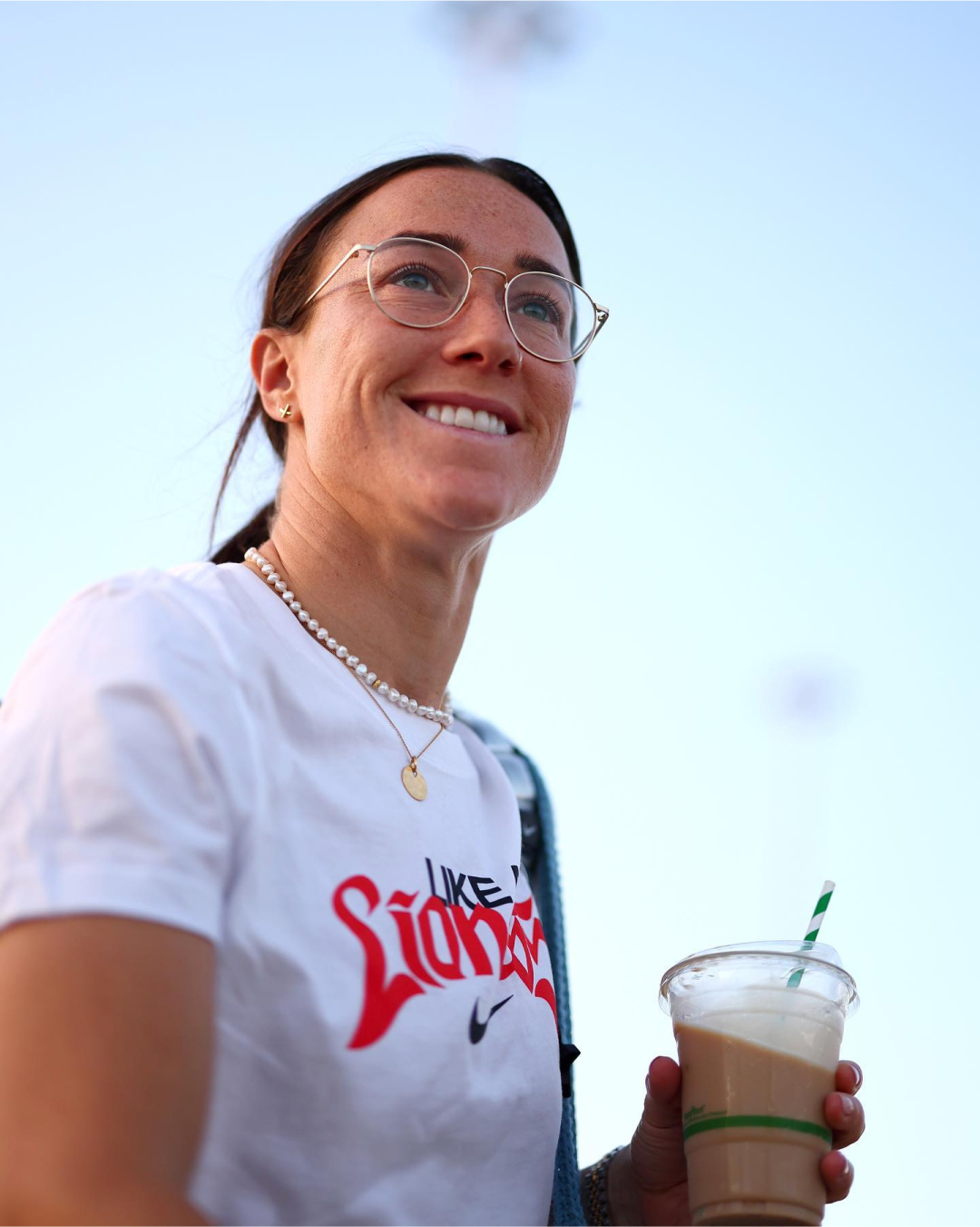
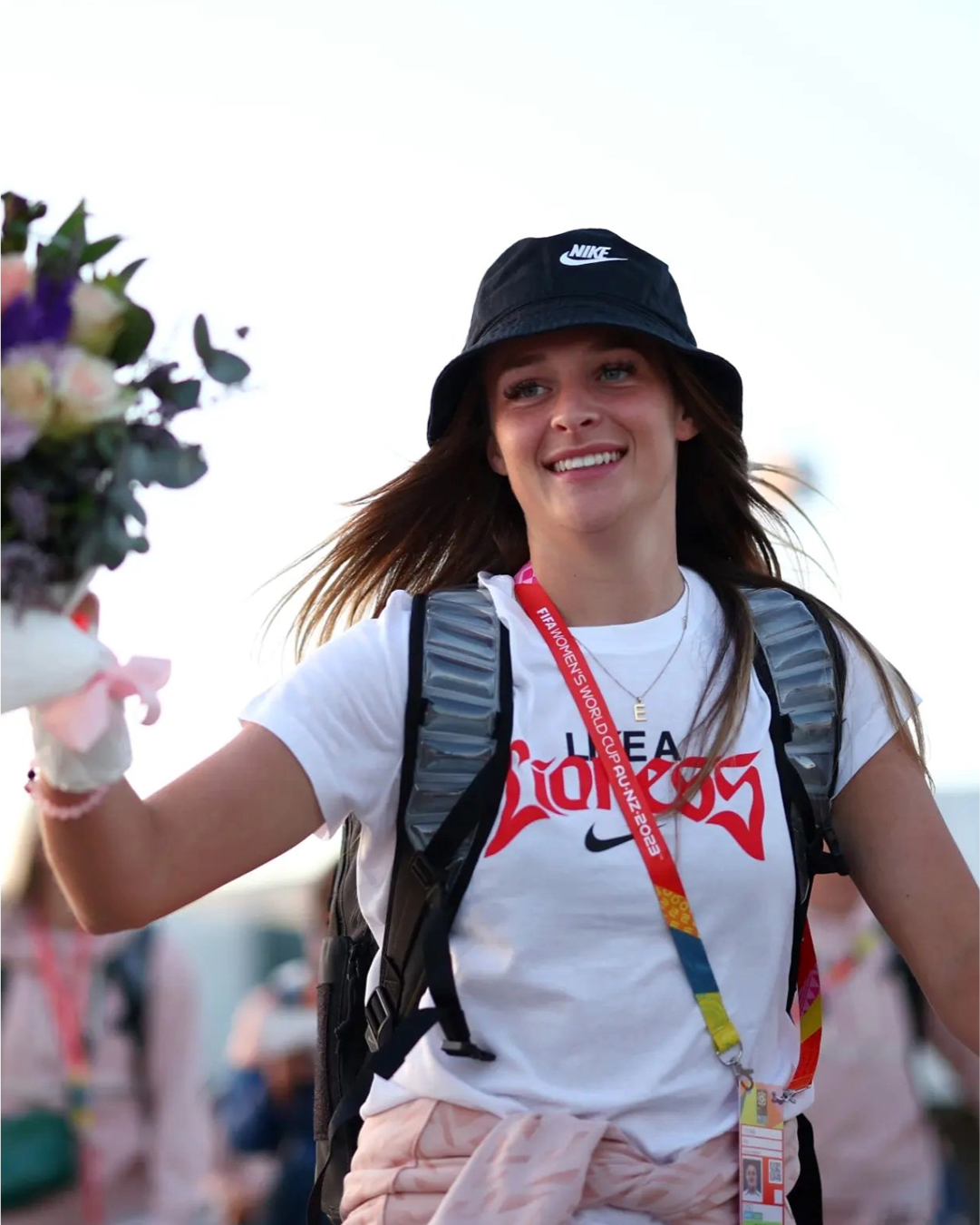
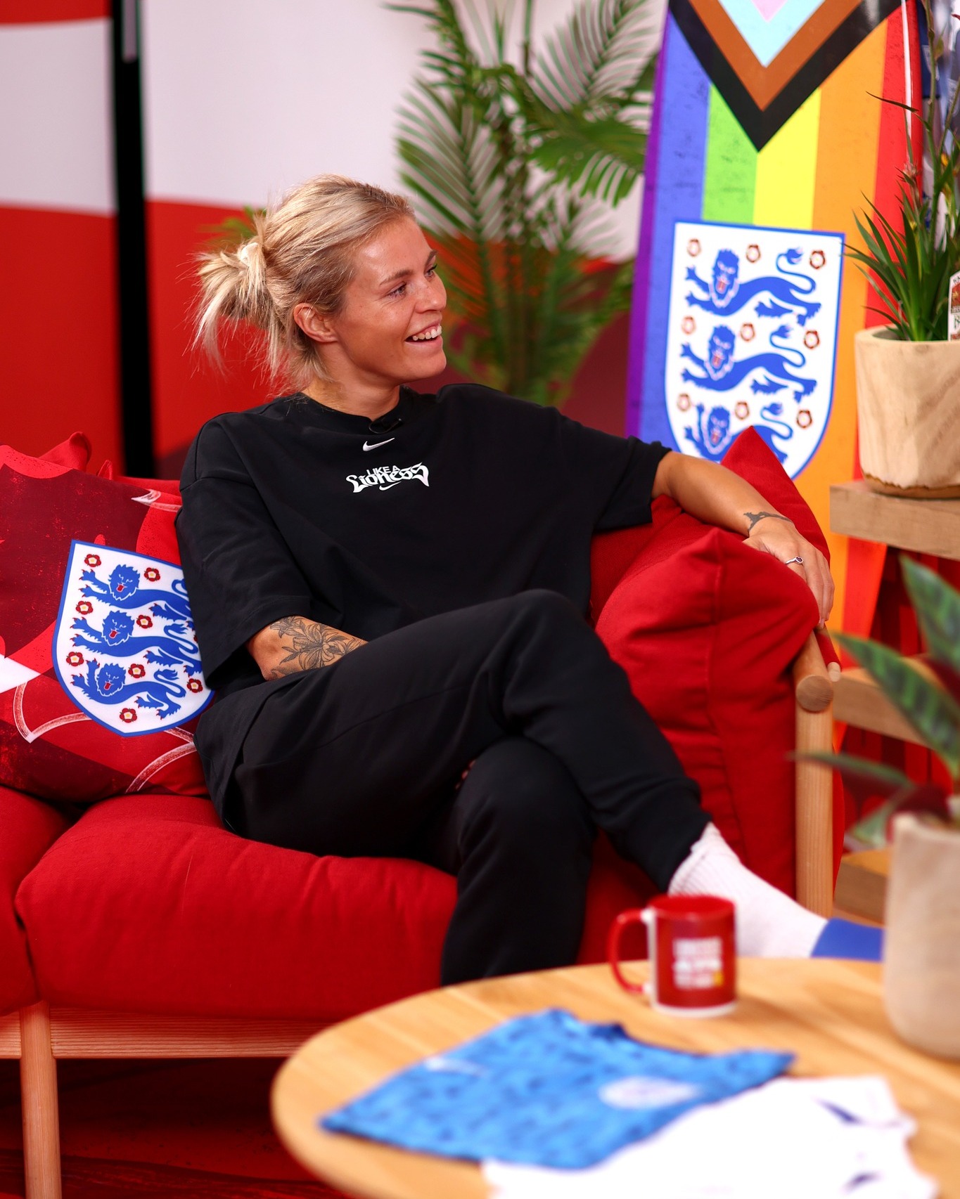
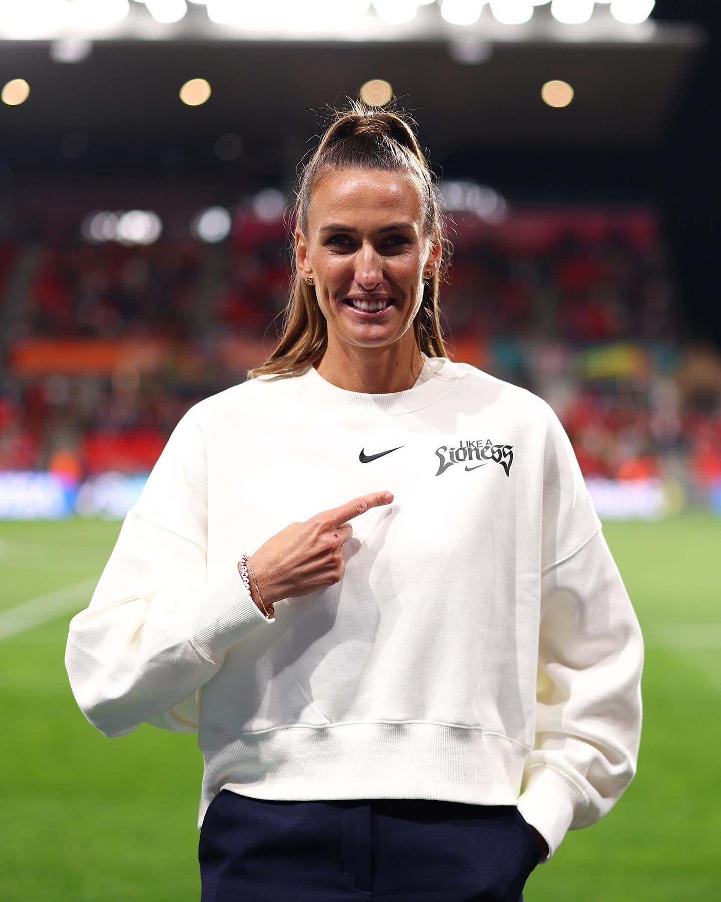
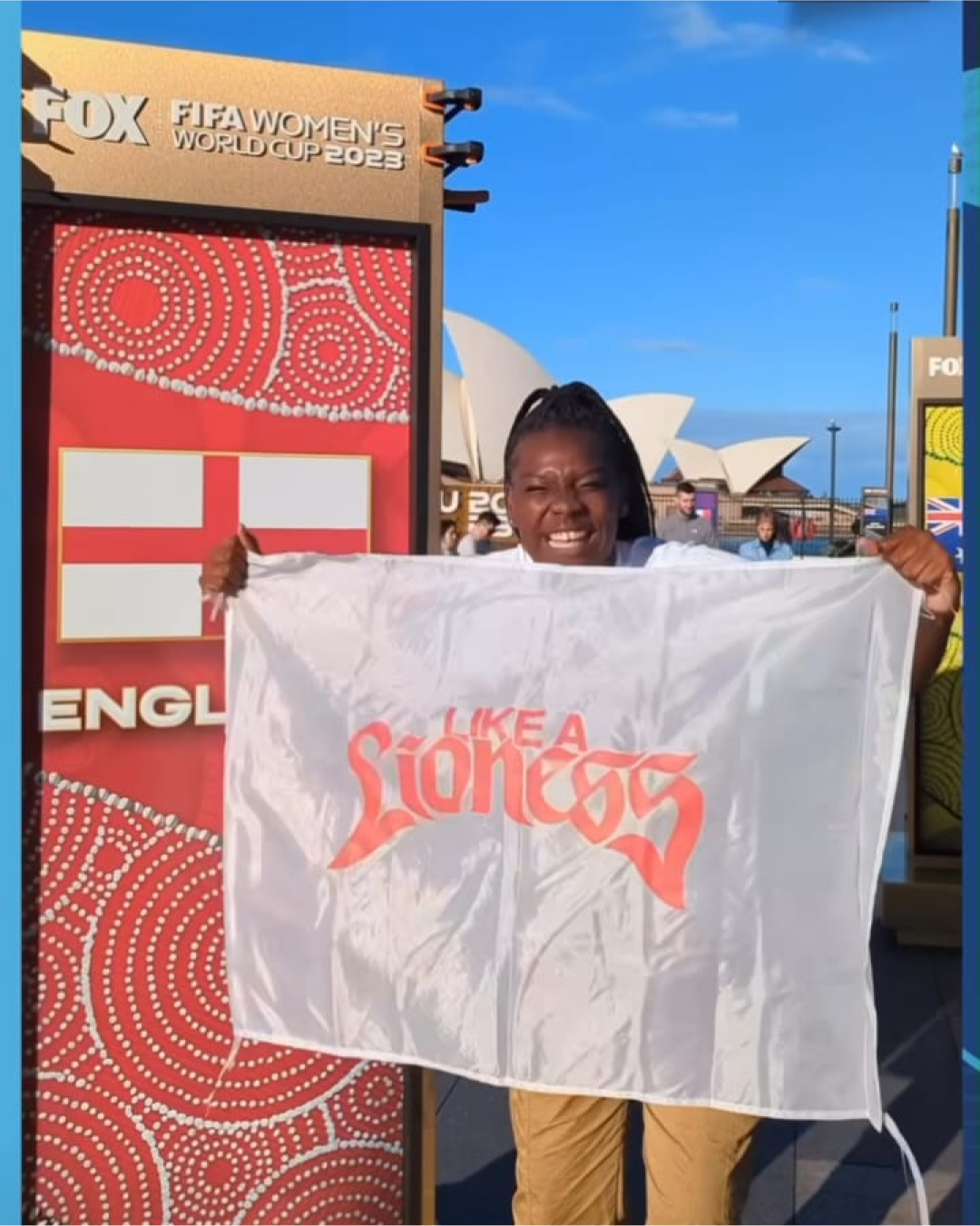
NIKE WC23 LIKE A LIONESS
W+K London
DESIGN
Justin Hallström
Josh Knight
Ananya Mohan
Ben Arfur
Mark Gilligan (3D)
W+K London
DESIGN
Justin Hallström
Josh Knight
Ananya Mohan
Ben Arfur
Mark Gilligan (3D)
Design for Nike’s Like a Lioness campaign. Launched with a film and a bespoke rap featuring Ms Banks, we designed merch that was donned by the likes of Marcus Rashford, Mason Mount, and of course the Lionesses. During the World Cup it showed up on everything from in-store events, to dj-booths and football boots.
View Film
View Film


SEED SAGA
Wieden+Kennedy
DESIGN
Kyle Ayuba
Ananya Mohan
Jonny Isaacson
CREATIVE
Aleks Atanasovski
Hannah Young
MOTION & 3D
Mark Gilligan
Manuel Martín Gavilán
Wieden+Kennedy
DESIGN
Kyle Ayuba
Ananya Mohan
Jonny Isaacson
CREATIVE
Aleks Atanasovski
Hannah Young
MOTION & 3D
Mark Gilligan
Manuel Martín Gavilán
2024
Packaging design for Seed Saga. Seeds that let you grow plants straight from the gaming world of Guild Wars 2. This campaign inspires gamers to transfer their in-game farming skills into the physical world, offering a glimpse into how these roles are vital for combating climate change. SeedSaga launches with an in-game Nature Walk, bridging the gap between the virtual and real world with gardening tips and how they can bring biodiversity into their neighbourhoods.


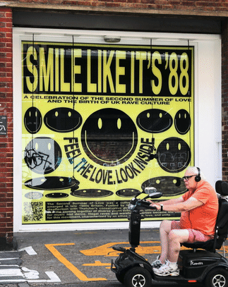
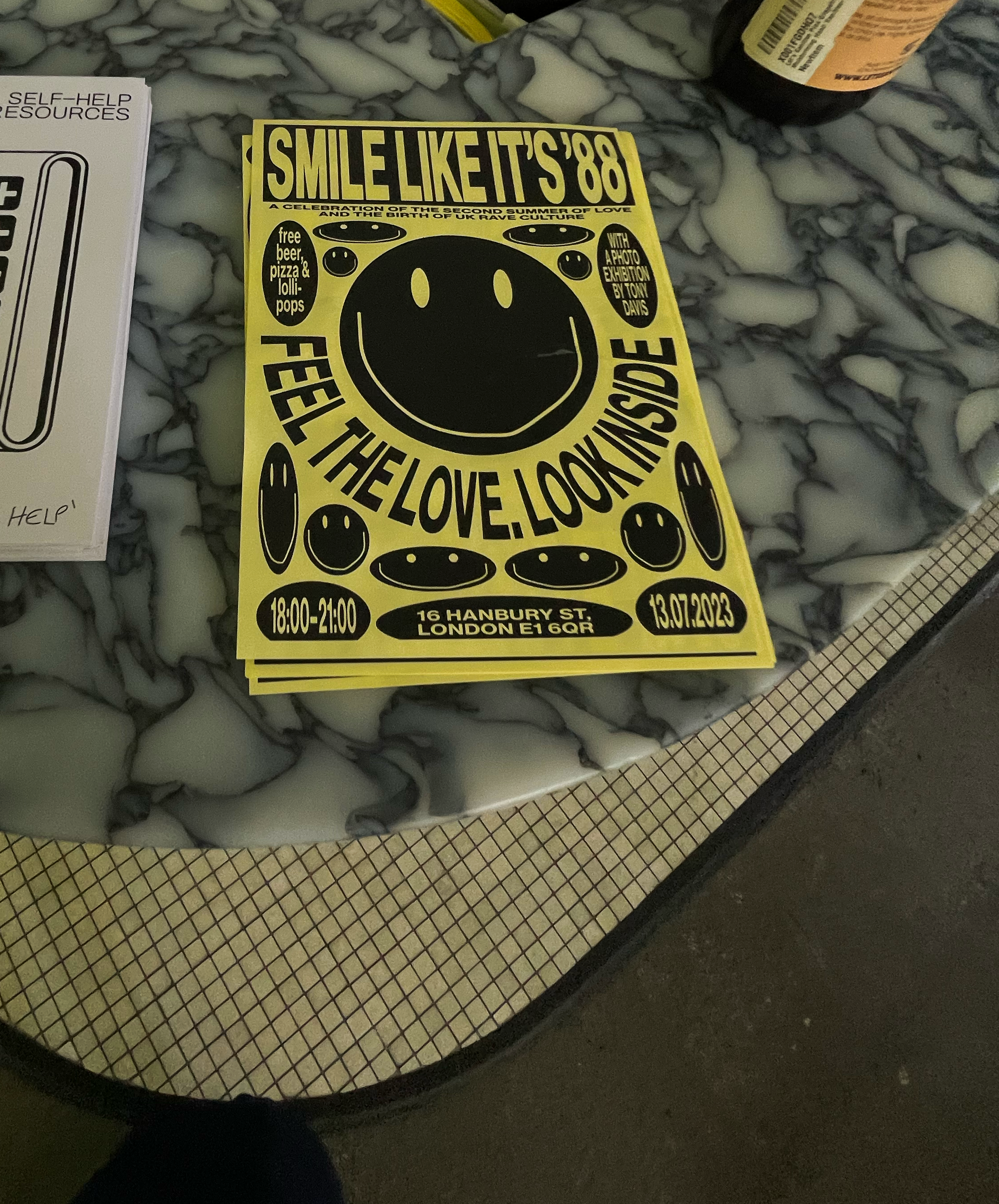
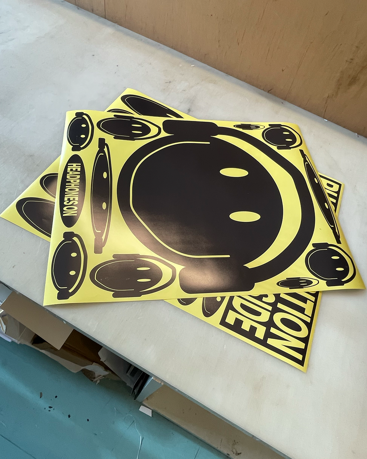
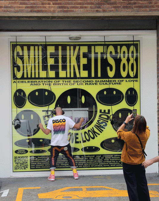
SMILE LIKE IT’S ‘88
W+K London
Creative: Gabriel Gayle
Design: Ananya Mohan
W+K London
Creative: Gabriel Gayle
Design: Ananya Mohan
2023
Window and gallery event at Hanbury Street celebrating 35 years since the Second Summer of Love.


NOT W+K
DESIGN + BRAND
Adam Rix
Anika Ramani
Adam Hunt
Ananya Mohan
CREATIVE TECHNOLOGIST
Jonathan Plackett
ICONS
Rezaul Alom
Lilia Quinaud
Zhangzhe Peng
MOTION
Jon Harris
Mark Gilligan
DESIGN + BRAND
Adam Rix
Anika Ramani
Adam Hunt
Ananya Mohan
CREATIVE TECHNOLOGIST
Jonathan Plackett
ICONS
Rezaul Alom
Lilia Quinaud
Zhangzhe Peng
MOTION
Jon Harris
Mark Gilligan
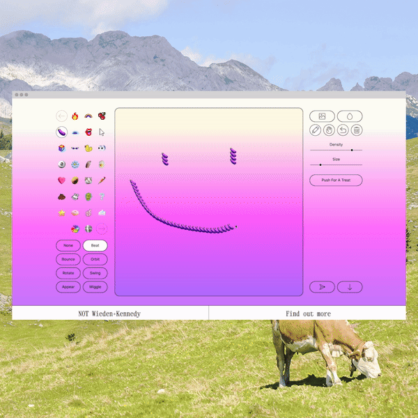
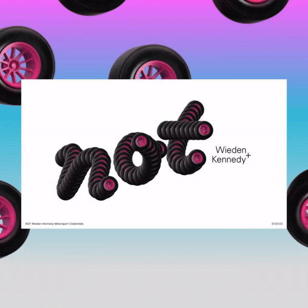
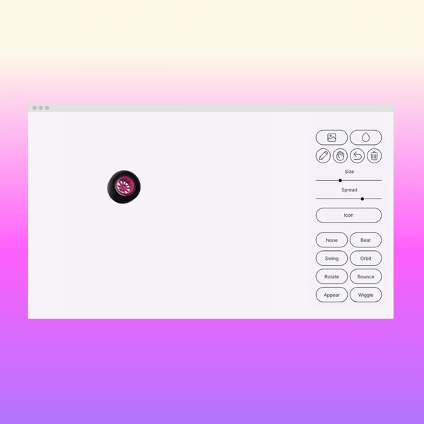
Identity for NOT W+K, where we birthed ‘The NOT Machine’ – a type and image generator allowing anyone to create the word ‘NOT’ out of any image or icon, and then to animate it.
It’s Nice That
Creative Review
Creative Boom
It’s Nice That
Creative Review
Creative Boom


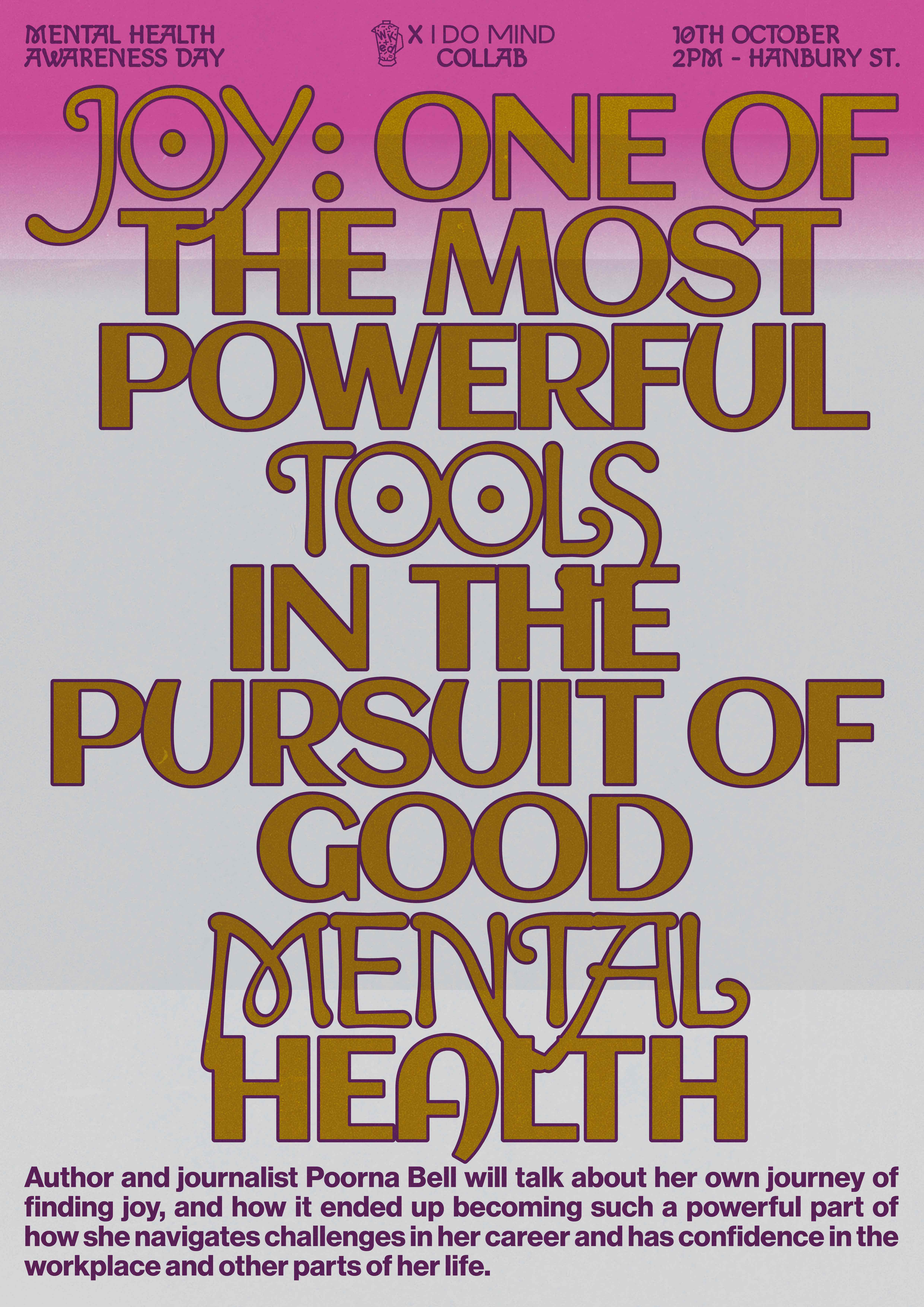
JOY:
2023
Poster for a mental health awareness day talk featuring award-winning journalist and author Poorna Bell.
KENNADISE
W+K London
DESIGN
Ananya Mohan
CREATIVE
Keke He
Gabriel Gayle
Preety Mudhar
Joe Bruce
MOTION
Jon Harris
W+K London
DESIGN
Ananya Mohan
CREATIVE
Keke He
Gabriel Gayle
Preety Mudhar
Joe Bruce
MOTION
Jon Harris
2023
Design for W+K’s Kennedys internship program KENNADISE, a paradise for all human creativity.


Type Design, Identity Design
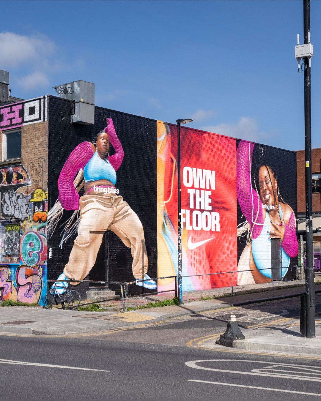
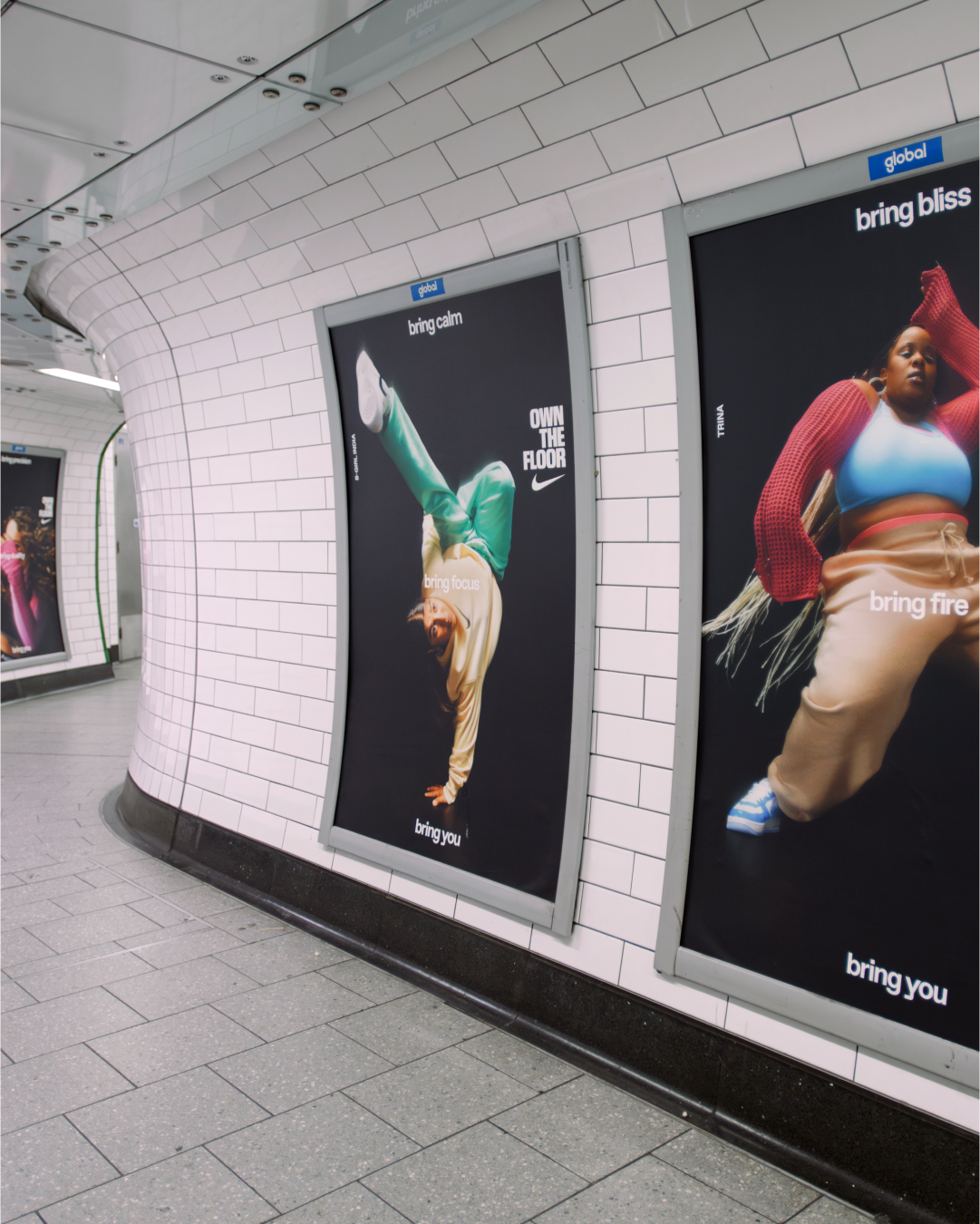
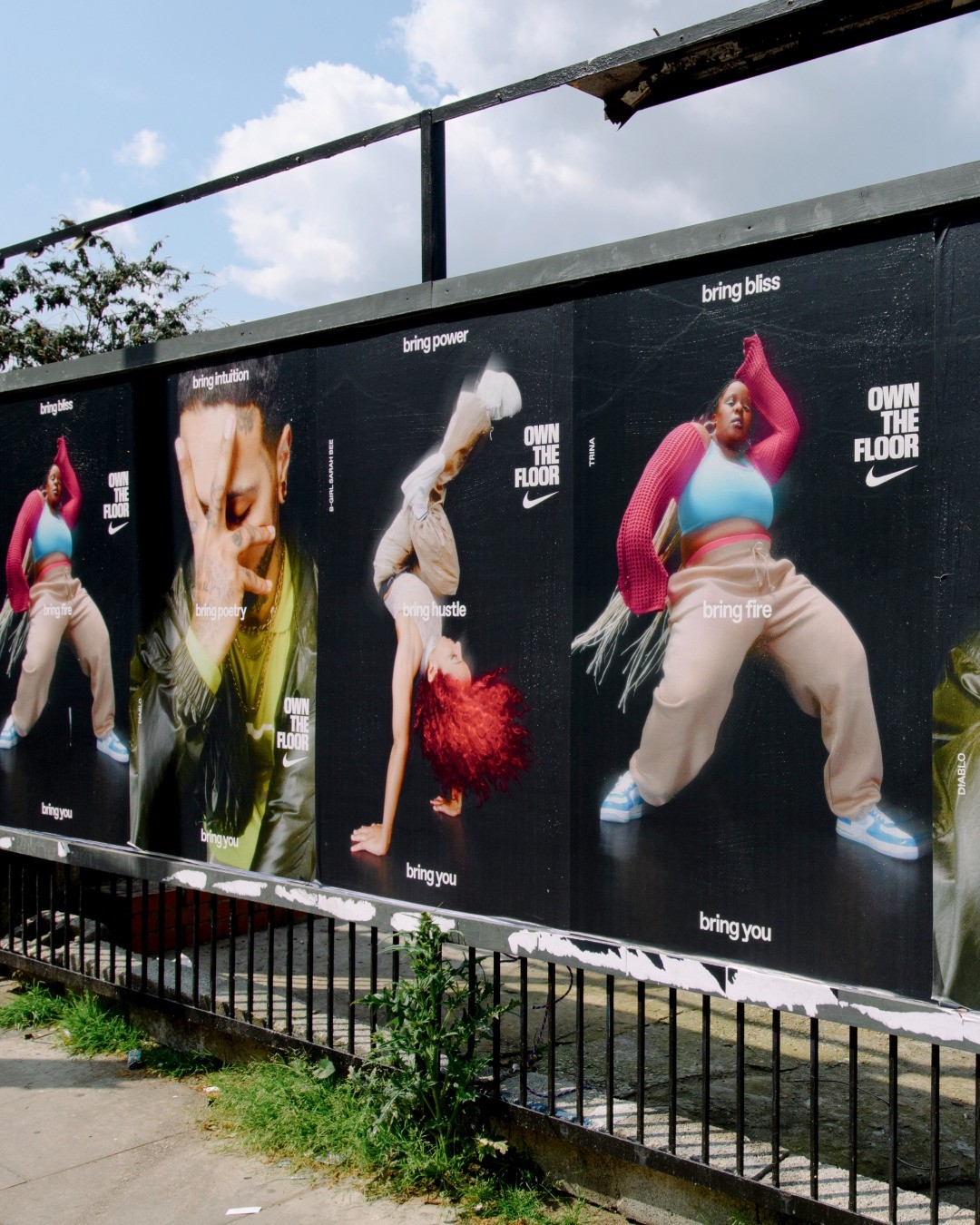
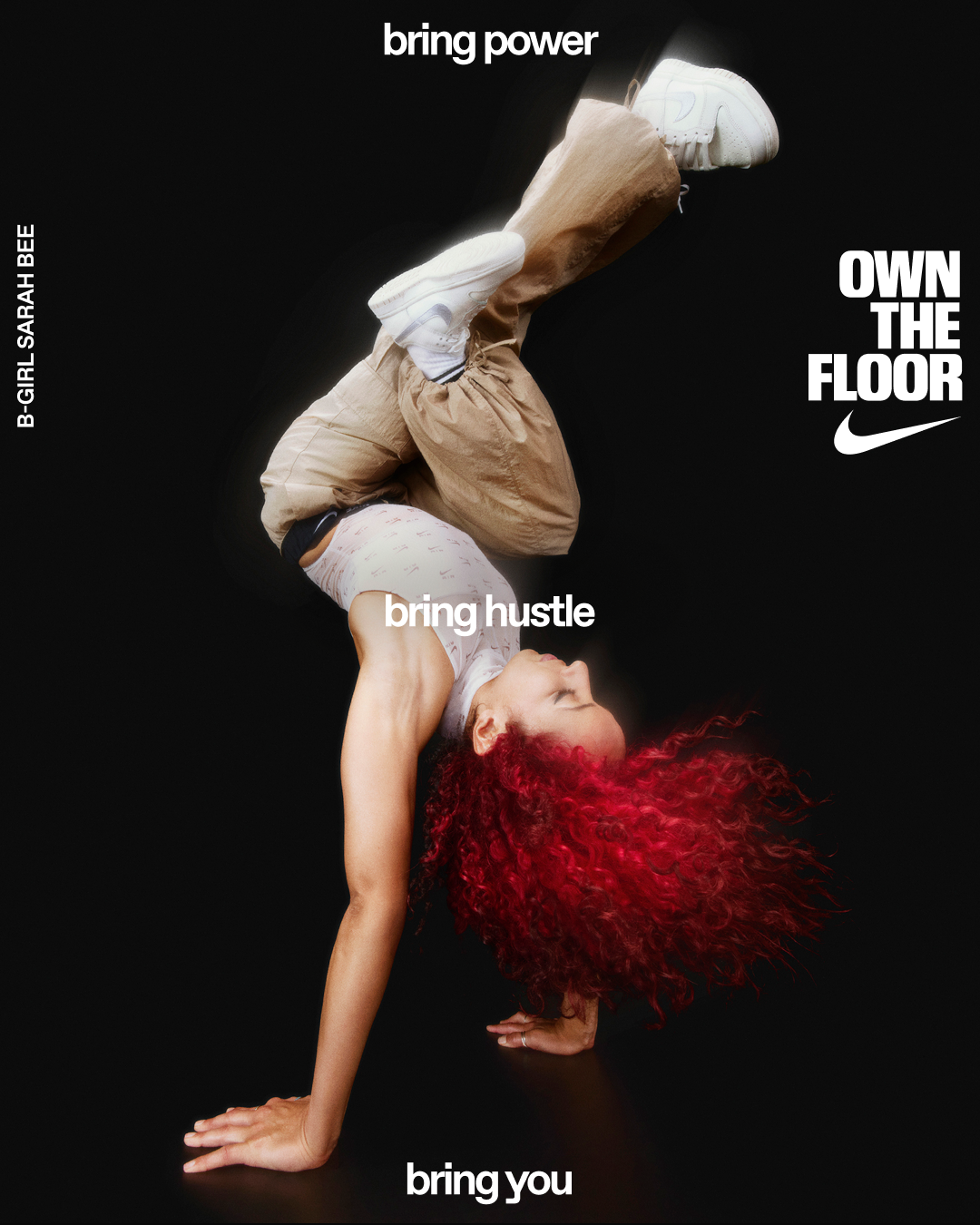
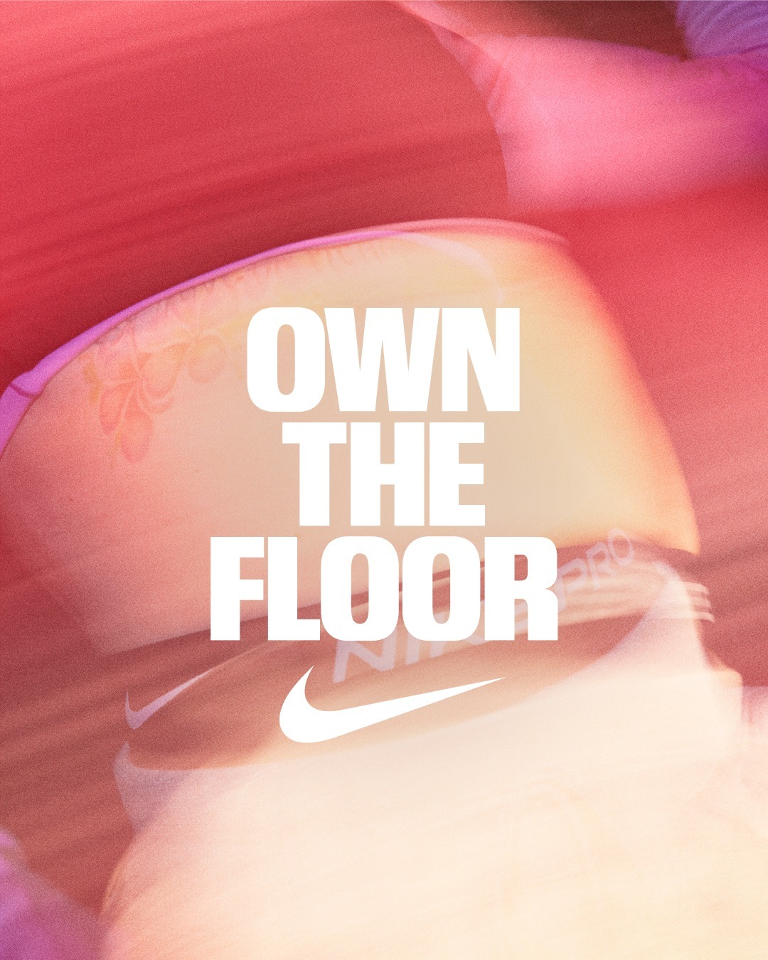
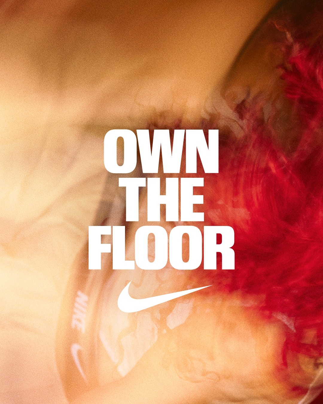
NIKE OWN THE FLOOR
W+K London
DESIGN
Justin Hallström
Lilia Quinaud
Ananya Mohan
PHOTOGRAPHER
Suzie and Leo
W+K London
DESIGN
Justin Hallström
Lilia Quinaud
Ananya Mohan
PHOTOGRAPHER
Suzie and Leo
2023
Design and art direction for Nike's ‘OWN THE FLOOR’ campaign, showcasing dancers from their POV – showcasing dance and the uniqueness dancers bring to the floor. Campaign rolled out all over Europe, taking in iconic OOH sites, in London, Paris, Milan, Berlin and beyond.


DURI
दूरी
Aaron Panesar
दूरी
Aaron Panesar
W.I.P.
Design and wordmark for DURI, a print publication and online platform that highlights and documents British South Asian presence in culture.

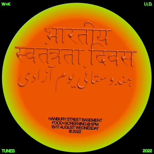
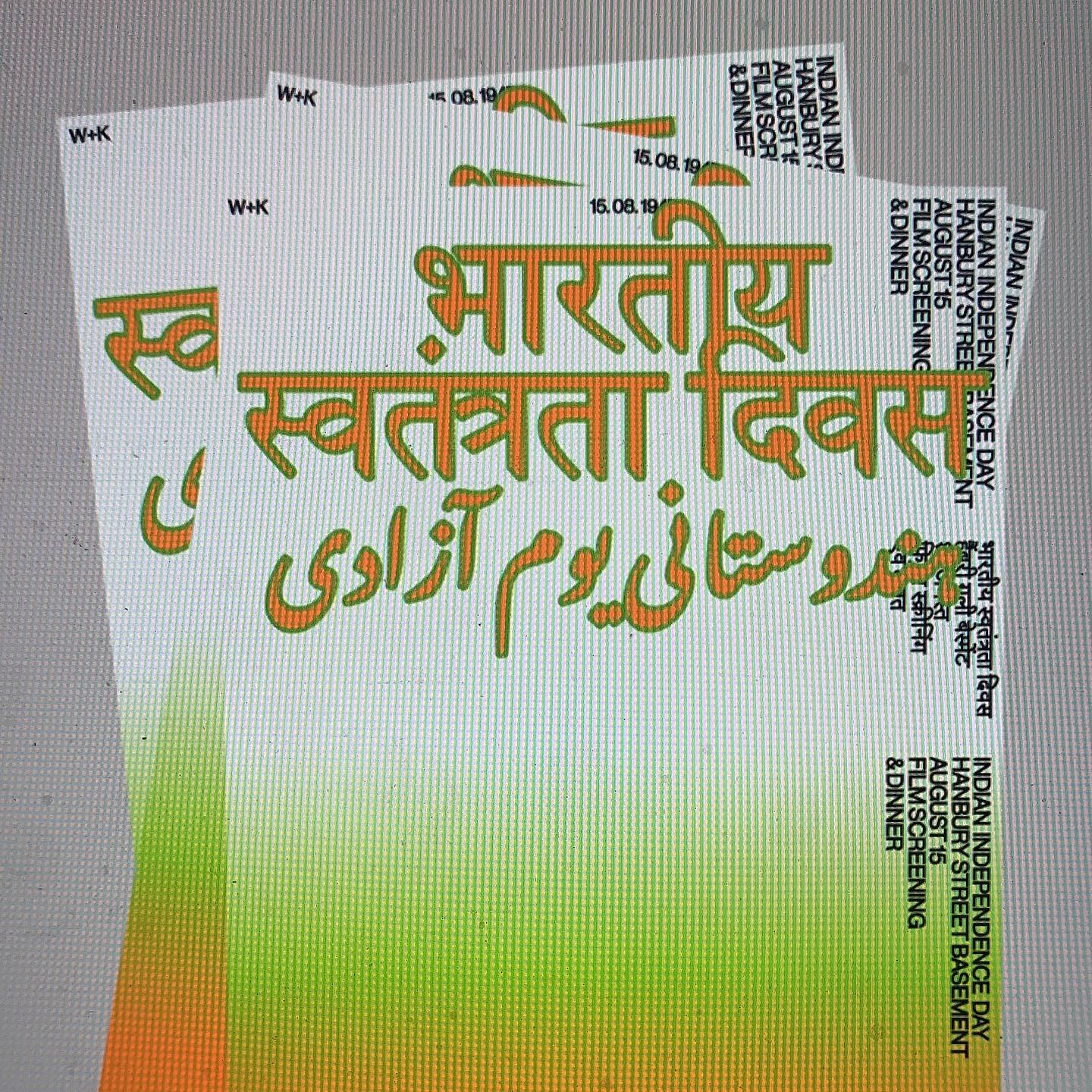
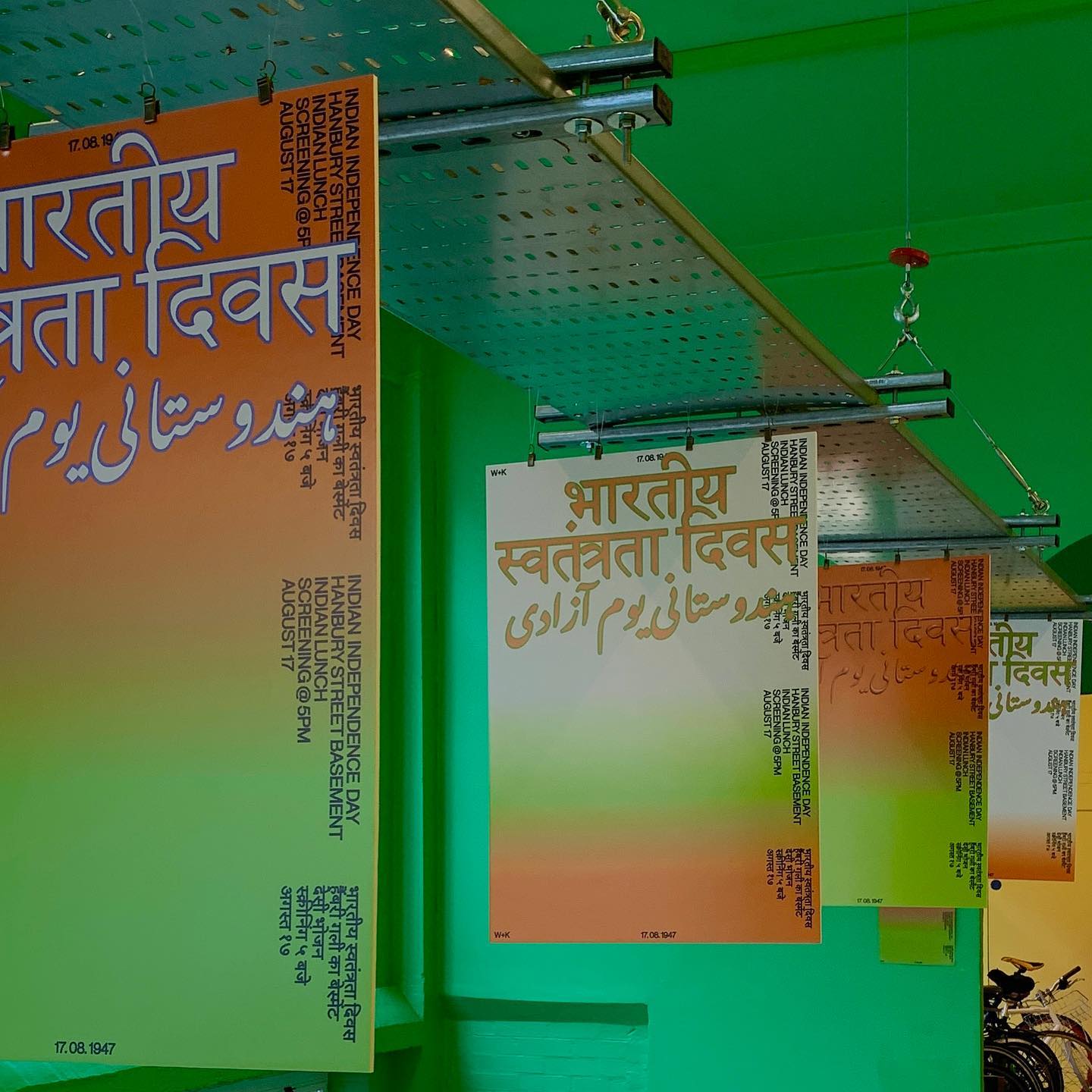
INDEPENDENCE DAY
भारतीय स्वत्रांतरता दिवस
W+K London
Umar Butt
भारतीय स्वत्रांतरता दिवस
W+K London
Umar Butt
2022
Design for event celebrating the Indian Independence from the British, in Britain.


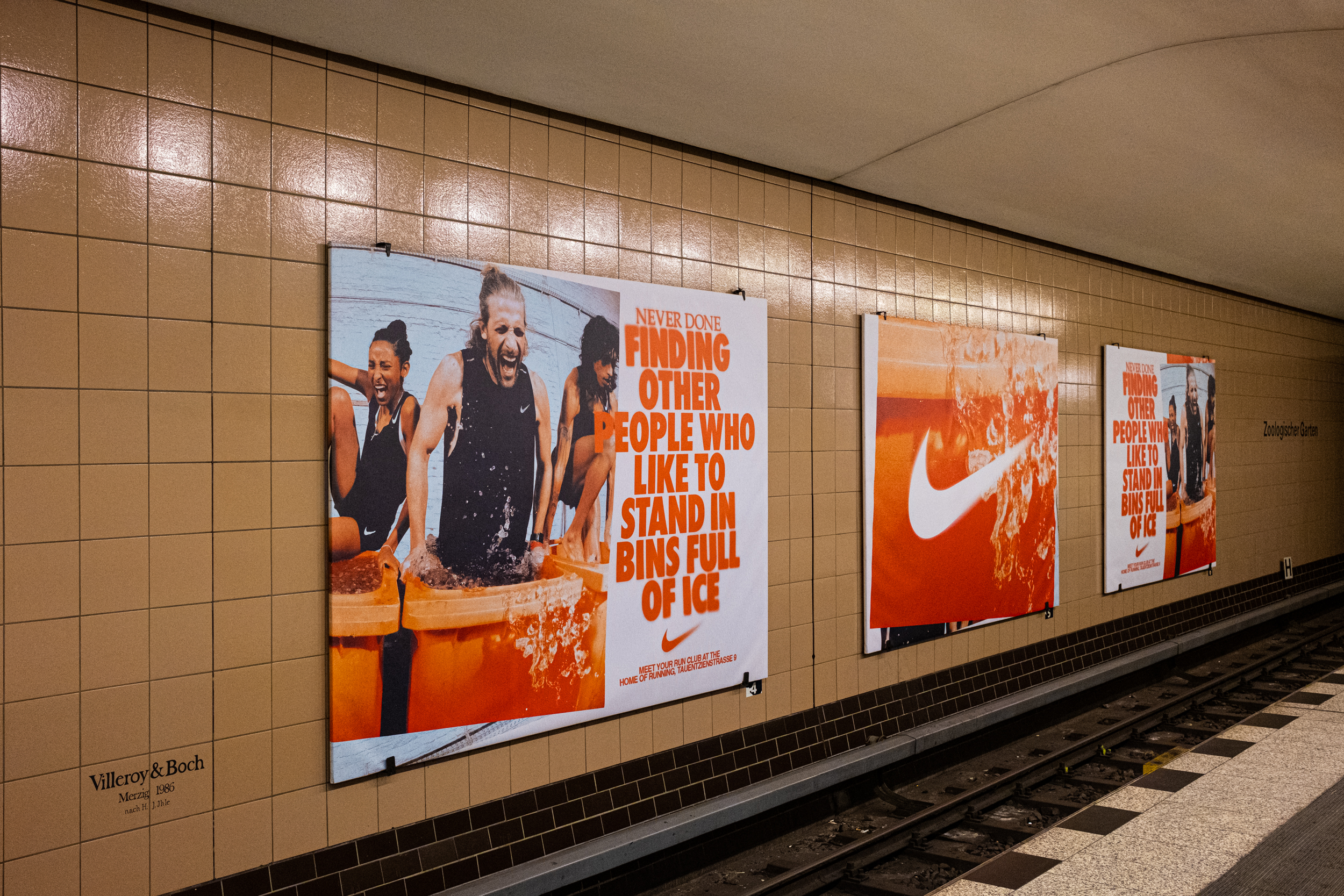
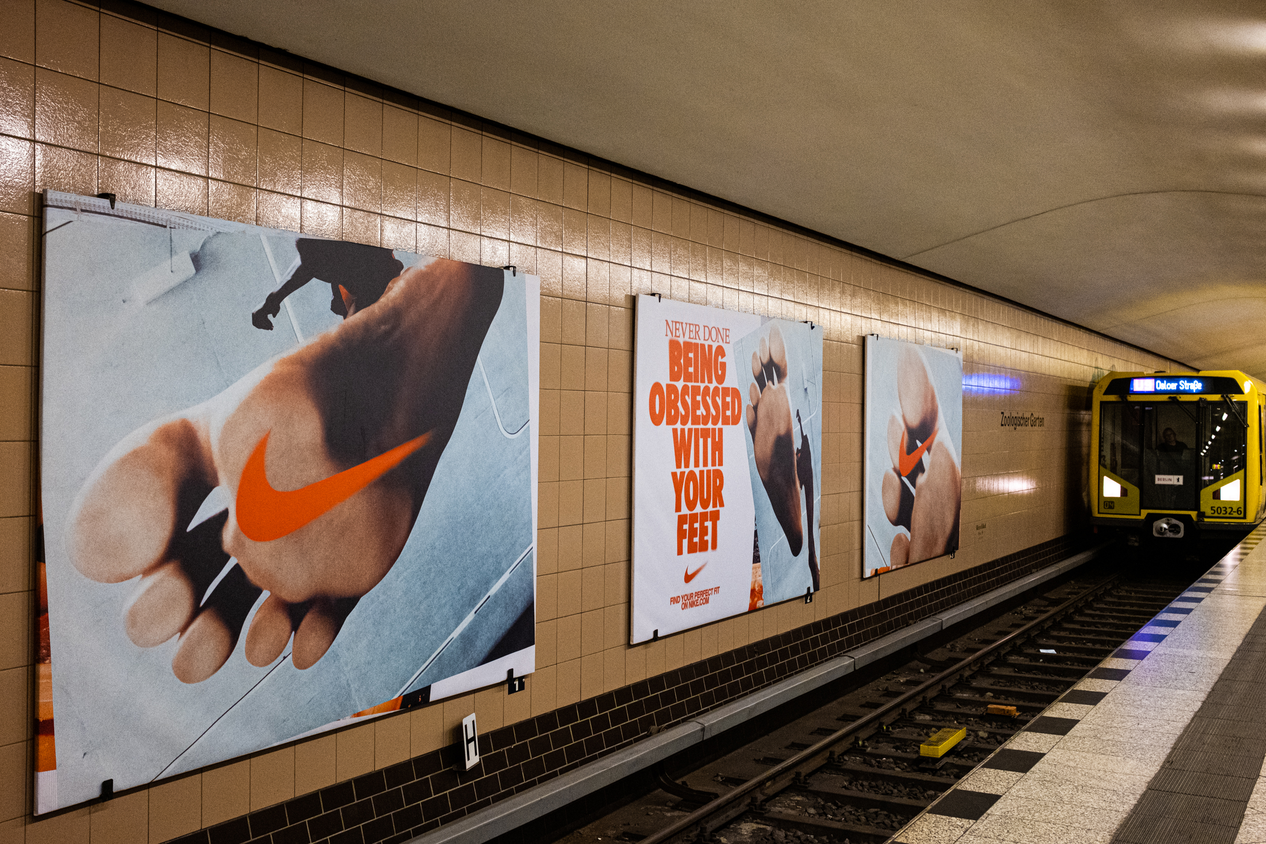
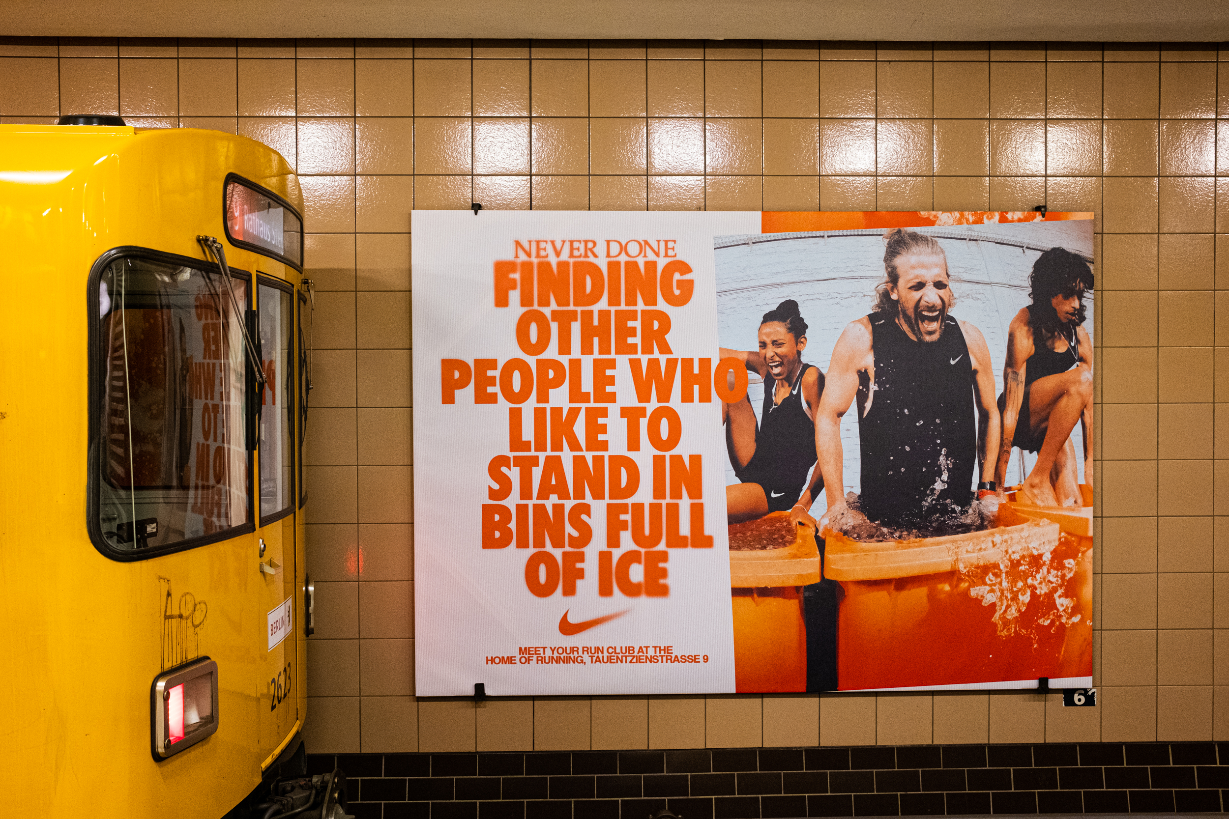
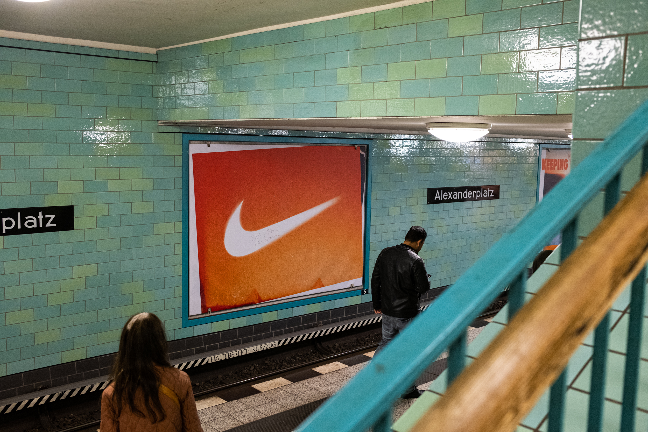
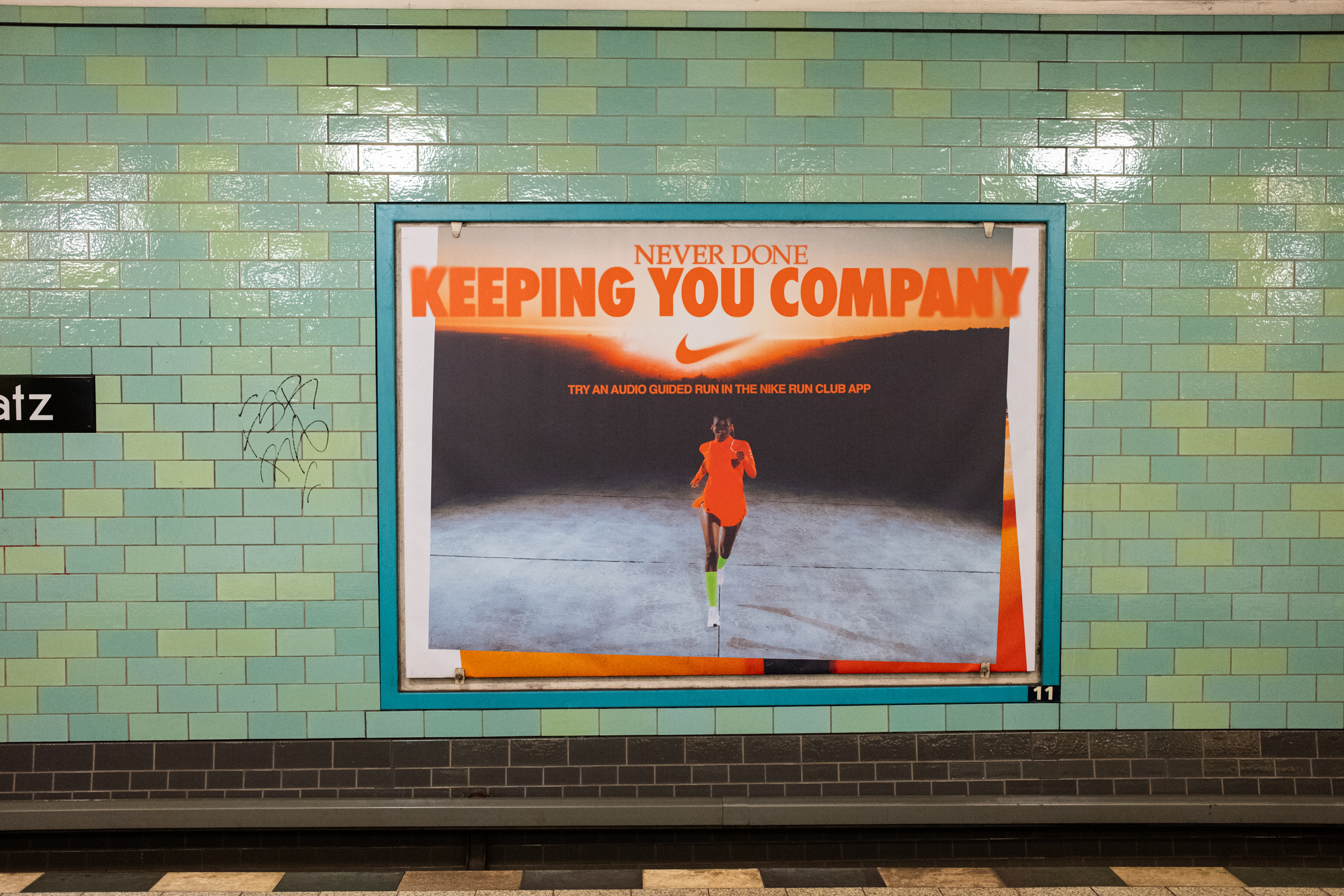
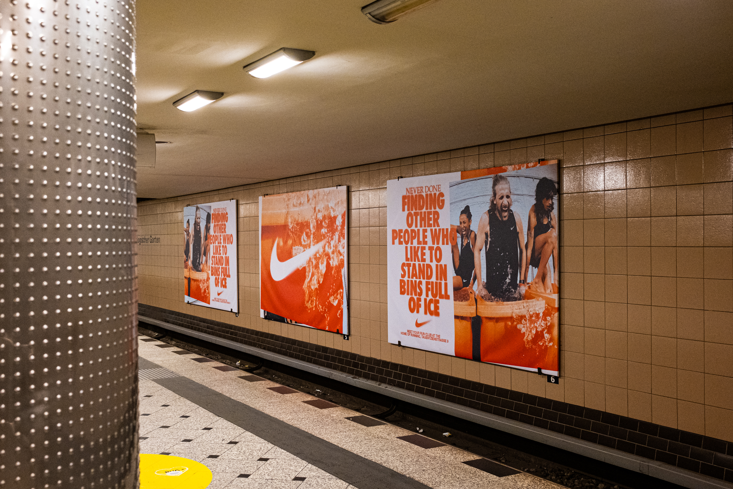
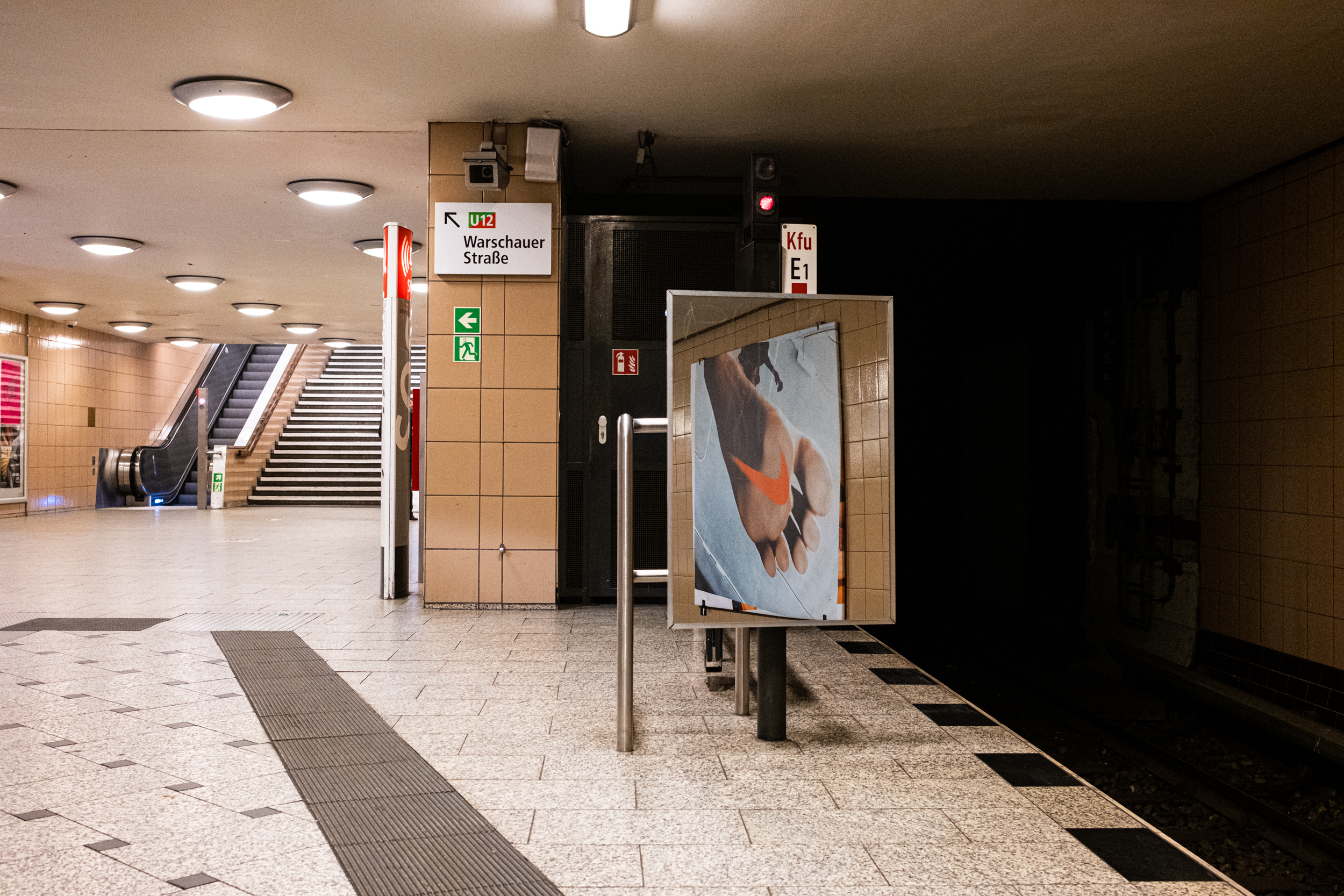
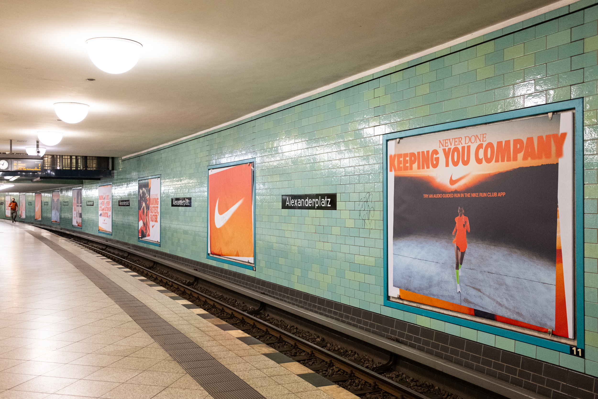
NIKE RUNNING BERLIN
W+K London
DESIGN
Justin Hallström
Jonny Isaacson
Ananya Mohan
Arabella Swan
PHOTOGRAPHER
Jeremy Soma
W+K London
DESIGN
Justin Hallström
Jonny Isaacson
Ananya Mohan
Arabella Swan
PHOTOGRAPHER
Jeremy Soma
2022
Design for Nike’s Berlin campaign, appearing in sites in and around the city.
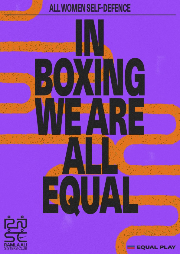
NIKE RAMLA ALI SISTERS CLUB
Mohammed Samad x Nike Brand Creative
DESIGN
Mohammed Samad
Ananya Mohan
NIKE TEAM
Cissy Lott Lavigna
PK
Joep Pingen
Sabrina Maerky
Mohammed Samad x Nike Brand Creative
DESIGN
Mohammed Samad
Ananya Mohan
NIKE TEAM
Cissy Lott Lavigna
PK
Joep Pingen
Sabrina Maerky
2021
Design for Ramla Ali Sisters Club, a boxing initiative founded by boxer Ramla Ali to highlight women of colour and religious minorities in the sport.


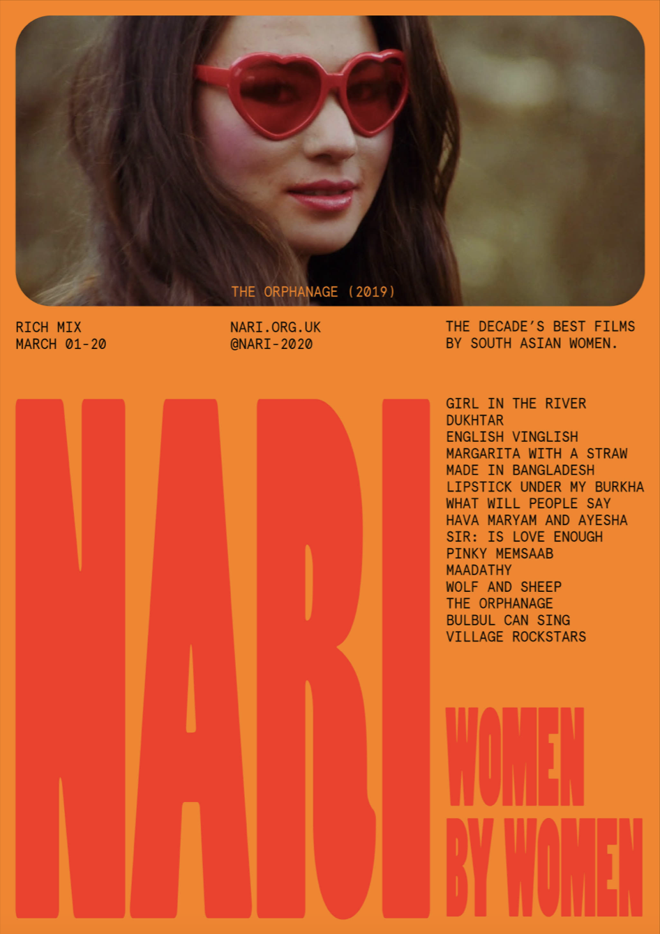
NARI FILM FESTIVAL
नारी चलचित्र महोत्सव
नारी चलचित्र महोत्सव
2020
NARI (sanskrit: woman), a (fictional) festival celebrating the decade’s best films by South Asian women.
Behance
Behance


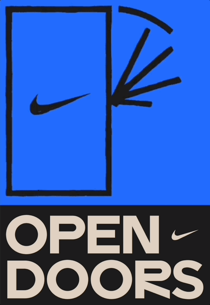
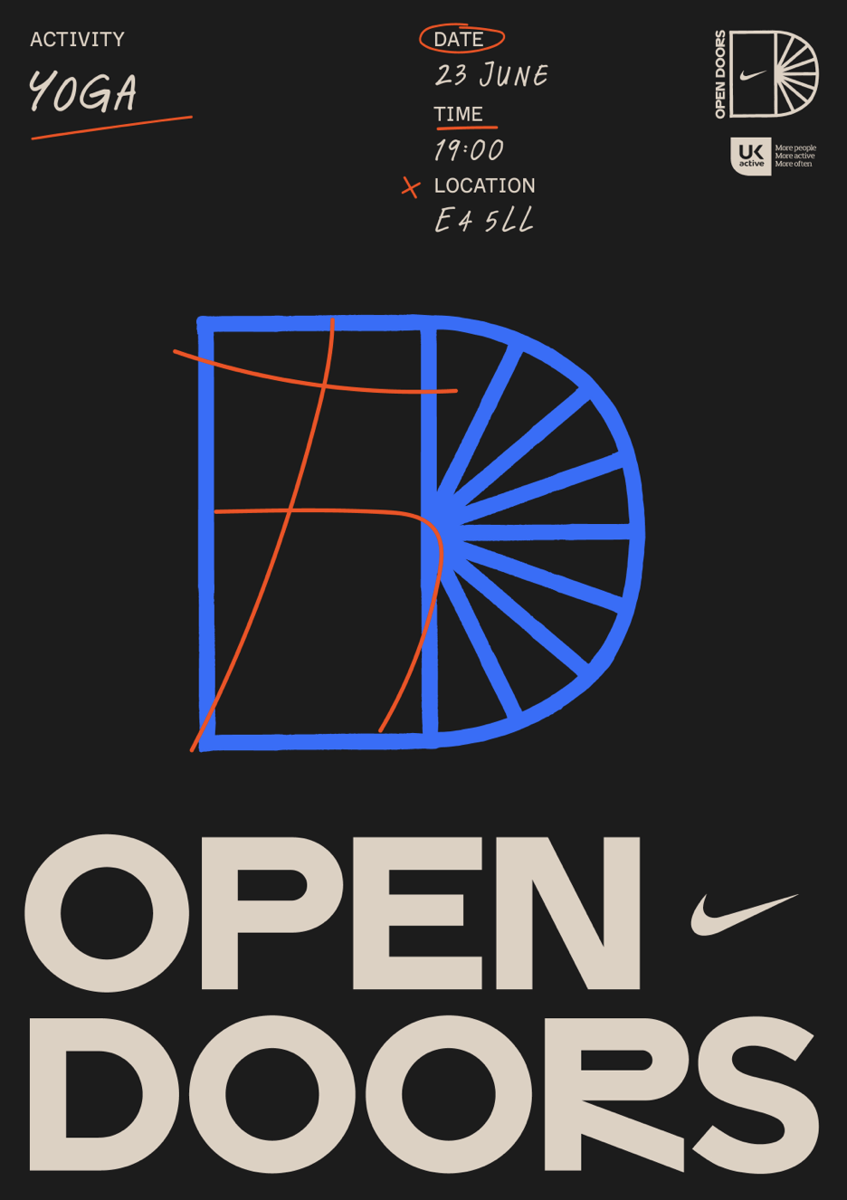
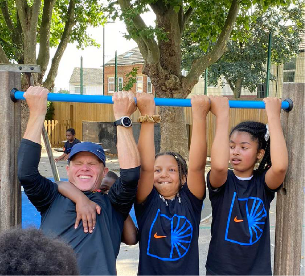
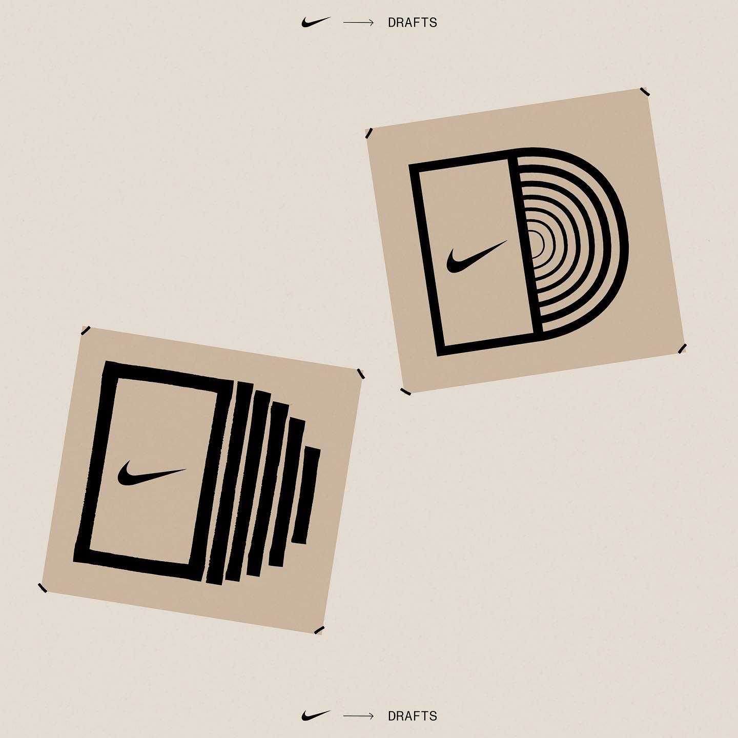
NIKE OPEN DOORS
Mohammed Samad x Nike Brand Creative
DESIGN
Mohammed Samad
Ananya Mohan
MOTION
Jack Collis
NIKE TEAM
PK
Cissy Lott Lavigna
Joep Pingen
Sabrina Maerky
Anthony Smith
Nina Ririmasse
Mohammed Samad x Nike Brand Creative
DESIGN
Mohammed Samad
Ananya Mohan
MOTION
Jack Collis
NIKE TEAM
PK
Cissy Lott Lavigna
Joep Pingen
Sabrina Maerky
Anthony Smith
Nina Ririmasse
2021
Open Doors is an initiative led by Nike iron-man athlete, John McAvoy. The programme aims to provide opportunities for disadvantaged youth through unlocking under-utilised school facilities during the summer months and tackling issues such as inactivity, community disengagement and holiday hunger.


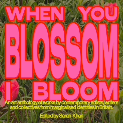
WHEN YOU BLOSSOM I BLOOM
Sarah Khan
Sarah Khan
2021
Design for a collection of essays, artworks and interviews in the art book When You Blossom I Bloom explore the multiple ways in which marginalised identities are rendered visible in contemporary culture through self and collective exploration.
Edited by Sarah Khan
Edited by Sarah Khan


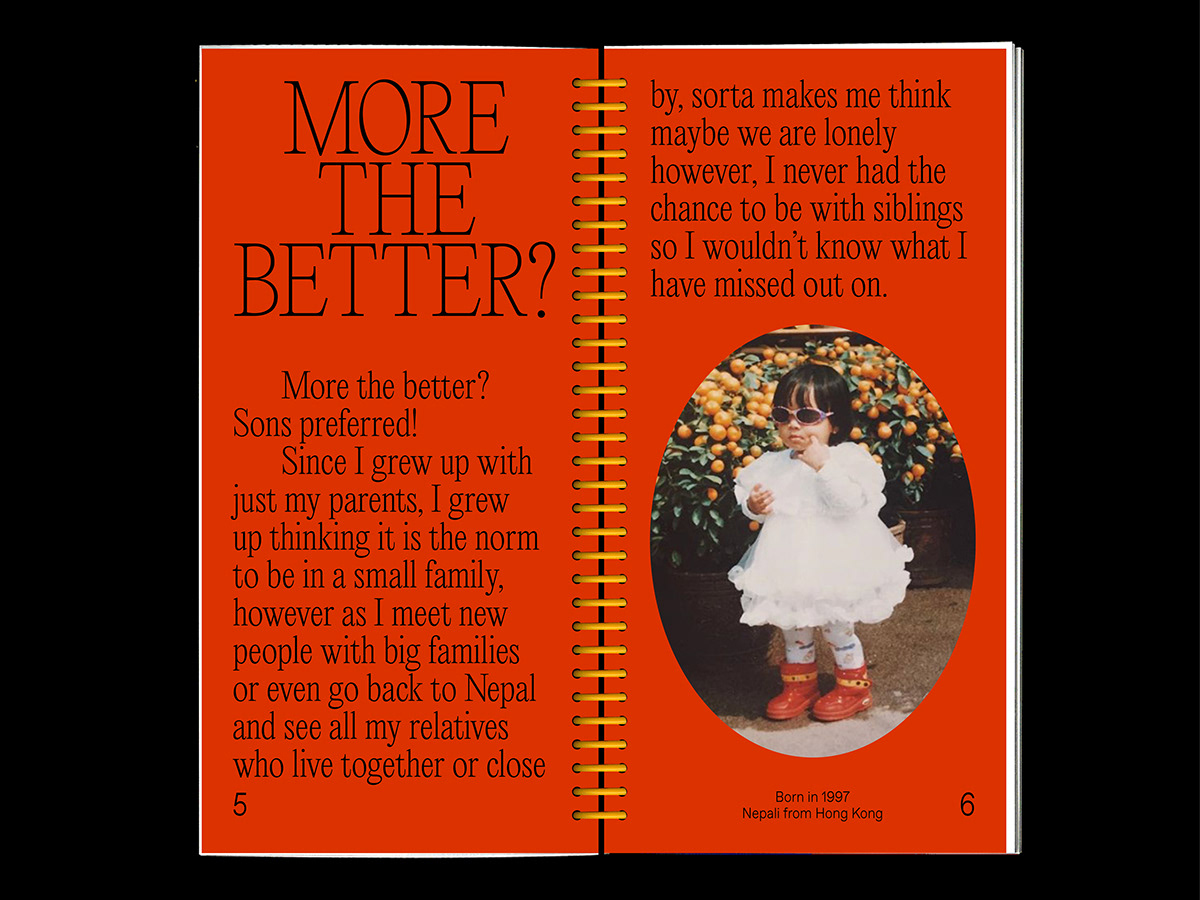
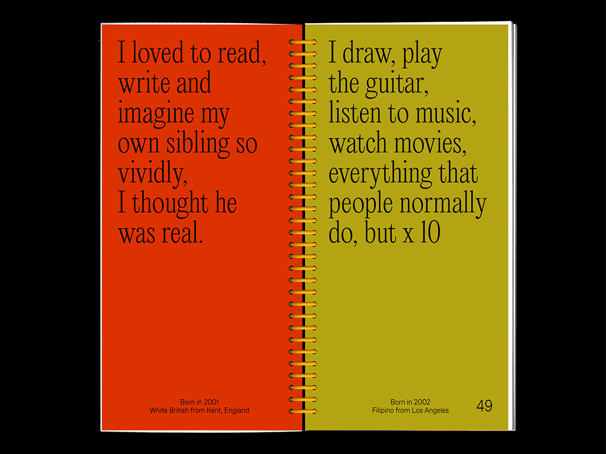
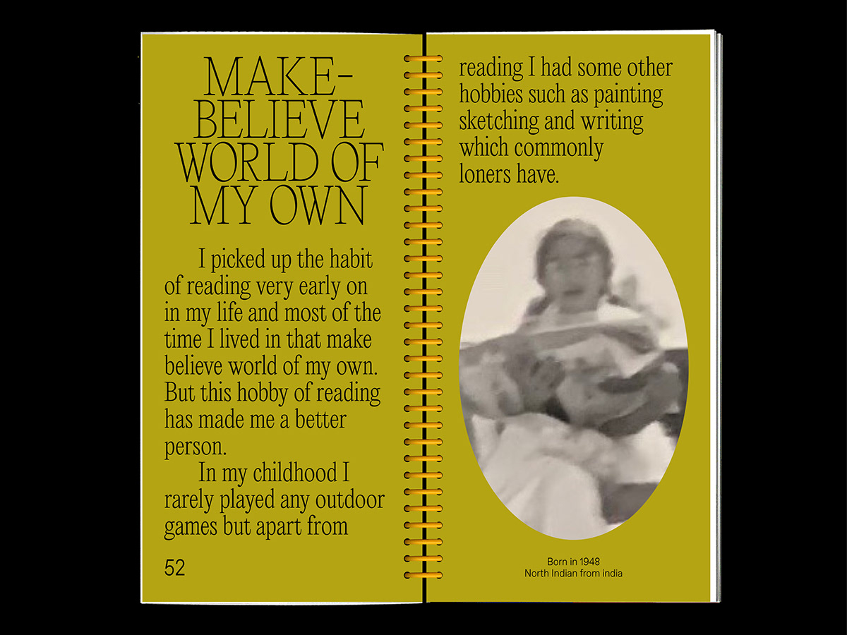
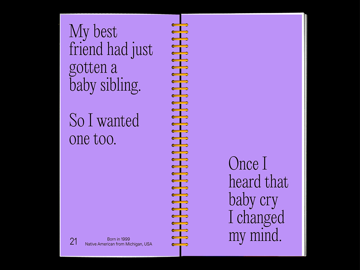
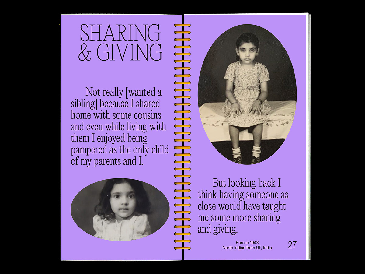
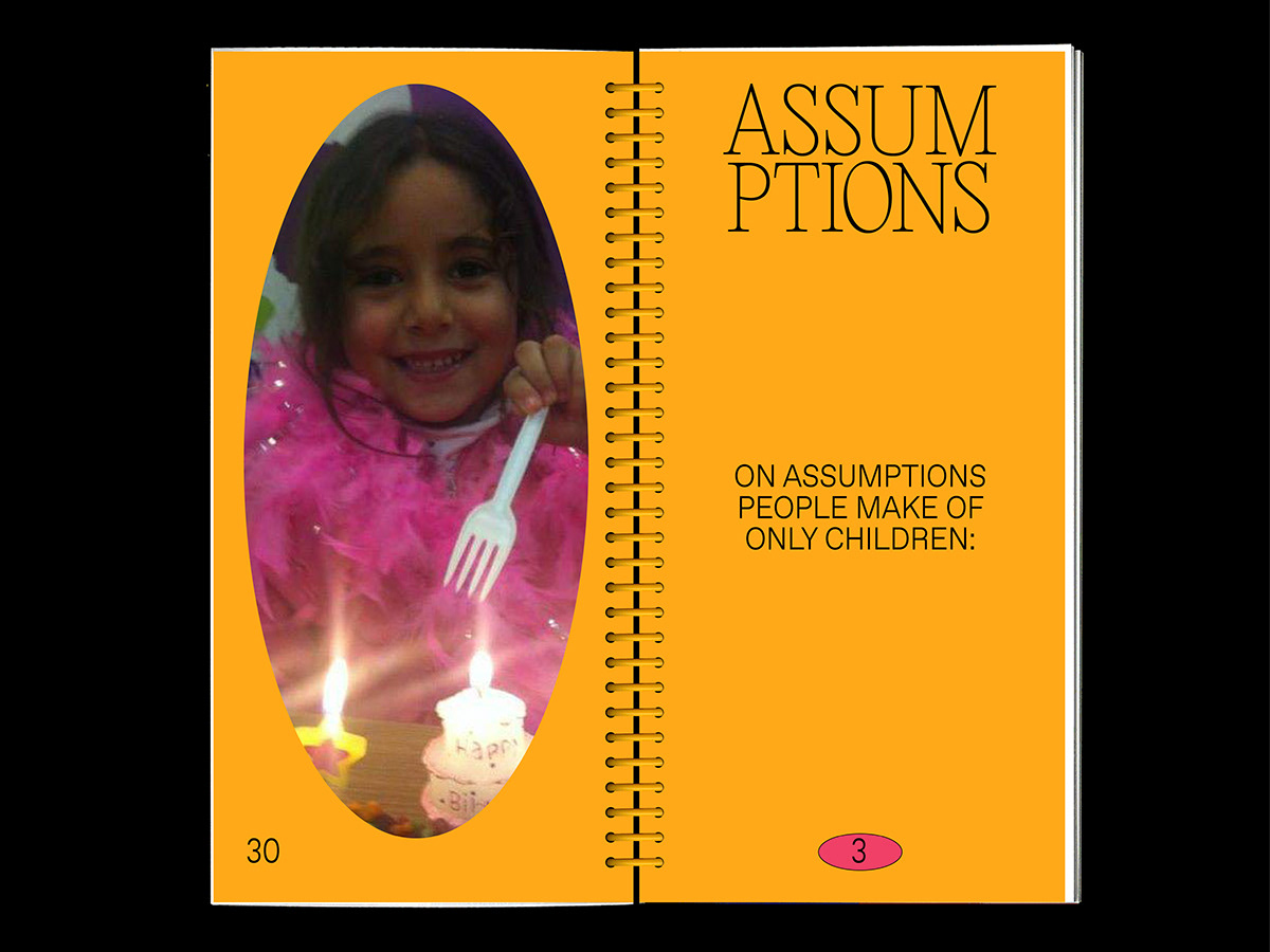
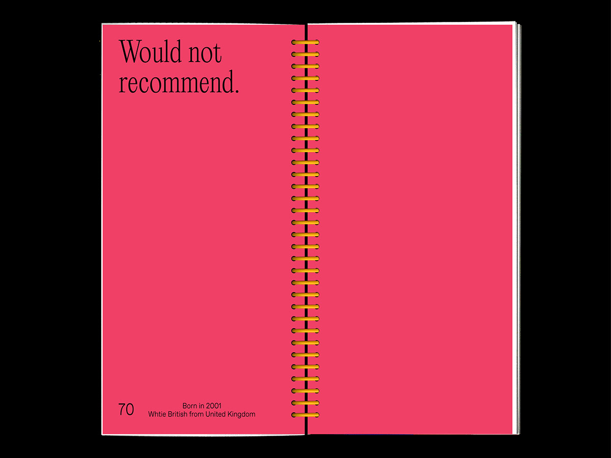
ONLY CHILD
2020
A light-hearted publication featuring a collection of unique experiences and thoughts that come with growing up as an only child across different factors. It plays with bright colours, large type, and nostalgic childhood portraits to create a childlike essence.


लंदन स्थित डिज़ाइनर जिन्हें शब्दों और रंगो से प्रेम है। फ़िलहाल वह ‘नॉट वाइडेन और केनेडी’ का हिस्सा हैं। कभी-कभी वह फ़्रीलैन्स भी कर लेती हैं।